Whether updating from an older operating system to a more recent one, or making the switch to a completely different software there can sometimes be a bit of learning curve when you start in the new environment. The same can be said when upgrading from different versions of products, or using them in a new environment. FastTrack Schedule 10 helps to lessen that learning-curve on Windows by allowing users to easily switch between two unique interfaces. By default FastTrack Schedule 10 will launch and run in what is known as the Ribbon Interface. This interface offers a system of contextual menus that will change based on the current section of a program you are working in. For example, while working in FastTrack tools automatically change based on which of the three views you are in: Schedule, Calendar or Resource. This means you won’t have to go hunting for similar tools in different locations, resulting in a more streamlined workflow.
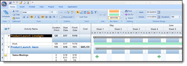
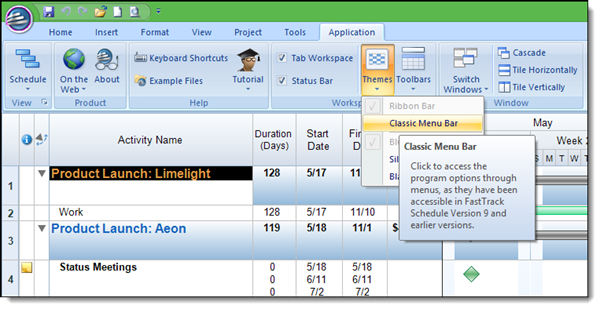
The Ribbon Interface will be a great option for users who are migrating from other project management apps, or for those who are using project management apps for the first time. This system offers a similar look and feel to other traditional productivity apps. If you are upgrading from an older version, moving from a different operating system, or just want a more simplified version of the interface, don’t worry. FastTrack Schedule 10 will allow you to easily transition into a separate interface, offering a mostly toolbar-oriented interaction. To make this change go to Application > Themes > Classic Menu Bar. You will then be prompted to re-launch FastTrack.
Once the application has restarted you will now be able to work in the Classic Interface. This interface offers a more “traditional” toolbar layout, which offers up all of the most frequently used tools. Like the Ribbon Interface, tools will automatically display if they can or cannot be used based on the current view you are in. In cases where a tool you need is not displayed, you easily use the drop-down menu system to select the tool, or even add the tool to the existing tool bar.
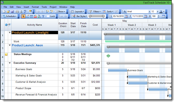
The Classic Interface will offer a familiar feel to users who have freshly upgraded from previous versions of FastTrack, or even for those who have transferred from the Mac version which offers a more visual tool-based interface. This interface shares a common look and feel with productivity apps from just a few years ago and will be well-suited for users who have not or do not want switch to more modern configurations. If you try both interfaces you always switch back to the one that you prefer. To go back to the Ribbon Interface while in the Class Interface, go to View > Themes > Ribbon Bar. Again, you will need to re-launch the application for the change to take place.
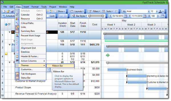
Offering two interfaces gives users the ability to easily pick what they are most comfortable with when they use the software. It also offers users the ability to grow and change how they use the software as they become more comfortable with all of its features. Who is the winner in your battle of Ribbon vs Classic Interfaces?

