
We’ve learned in previous blog posts how to easily format customized columns and calculations to track costs throughout our projects. When we’ve done this in the past, we’ve viewed the data per task but not as a distribution through the time of the project. FastTrack Schedule 10 gives us additional tools, which will allow us to display data, such as costs, from columns directly across time on the Timeline Graph.
In FastTrack Schedule 10, we can use Summary Graphs to display data other than Start and Finish Dates across our Timeline Graph. These Summary Graphs can allow us to view additional project data, such as the daily, weekly, month, quarterly, or even yearly cash flow of a project. Summary Graphs pull data from existing columns, so we will only need to format how we wish to display that data.
1. Go to Insert > Summary Graph
a. When inserting a Summary Graph, the Format Summary Graph dialog will automatically open
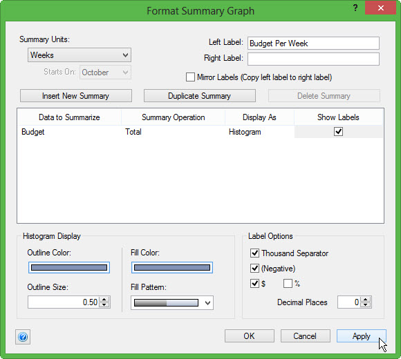
2. Enter a customized name for your graph, we will name ours Budget per Week
3. From the Summary Units drop down, select the units we will display data in, Weeks
4. Under Data to Summarize select the column you wish to show across the Timeline
a. Here, select Budget
5. From Summary Operation select Total, which will display the total budget per week
6. From Display As select the type of graph you wish to show Numeric Text, Histogram, or a Line Graph
a. Here we will choose Histogram which will display our data similar to a bar graph
7. Select the Show Labels box, which will allow us to see the exact value of our Budget per Week as text on the graph.
8. Finally, select Apply to save your graph and OK to close the Format Summary Graph dialog
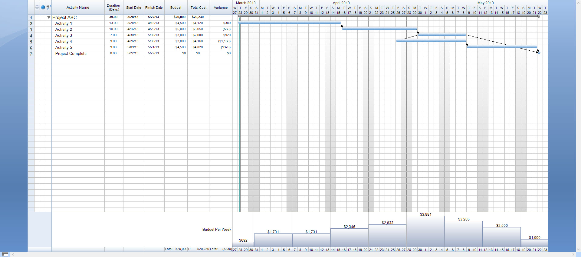
Now, when we view the Timeline Graph in our project we can view how our budget is actually distributed week by week.
With Summary Graphs we can show many other graphs in our project. For example, we can create a graph displaying multiple summaries. Summary Graphs that display multiple summaries are great for making comparisons between data in our project, such as Budget and Total Cost. Using a single Summary Graph we can easily view how our Total Cost will compare with our Budget in each individual week.
1. Go to Insert > Summary Graph
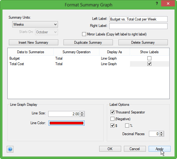
2. Enter your customized graph name, Budget vs. Total Cost per Week
3. From the Summary Units select Weeks
4. Under Data to Summarize select Budget
5. From Summary Operation select Total
6. From Display As select Line Graph
7. Next, select Insert New Summary
a. This will add an additional summary to the graph so that we can compare our Budget and Total Cost
8. Under Data to Summarize select Total Cost
9. From Summary Operation select Total
10. From Display As select Line Graph
11. Select the Show Labels box to show labels only on our Total Cost graph
12. Select Apply to save your graph and OK to close the dialog.
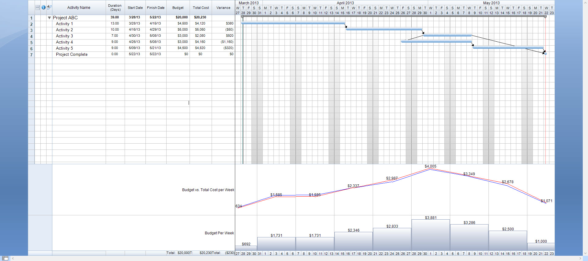
Once we’ve added our Budget vs. Total Cost per Week graph to our Timeline Graph, it is now very easy to view how the Budget and Total Cost compare weekly. We can also easily identify any weeks in our project that are currently over or under budget based on how the lines are drawn. In our graph, a red line represents Total Cost and blue represents Budget. Therefore, any week that we see red above blue we will know that we are over budget in our project.
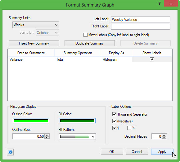
The last type of Summary Graph that we can add, can be used to show variance in project costs. This graph will allow us to see precisely each week we are over or under budget and the exact amount we are over/under by at that point in time.
1. Go to Insert > Summary Graph
2. Enter your customized graph name, Weekly Variance
3. From the Summary Units select Weeks
4. Under Data to Summarize select Variance
5. From Summary Operation select Total
6. From Display As select Histogram
a. When summarizing a column such as Variance, our histogram will show a line to represent 0 and draw bars above and below the line according to positive or negative values.
7. Select Show Labels to identify the exact over/under values
8. Select Apply to save and OK to close the Format Summary Graph dialog
Now, when we view our schedule, we can see the exact variance between our Budget and Actual Cost through each week of the project.
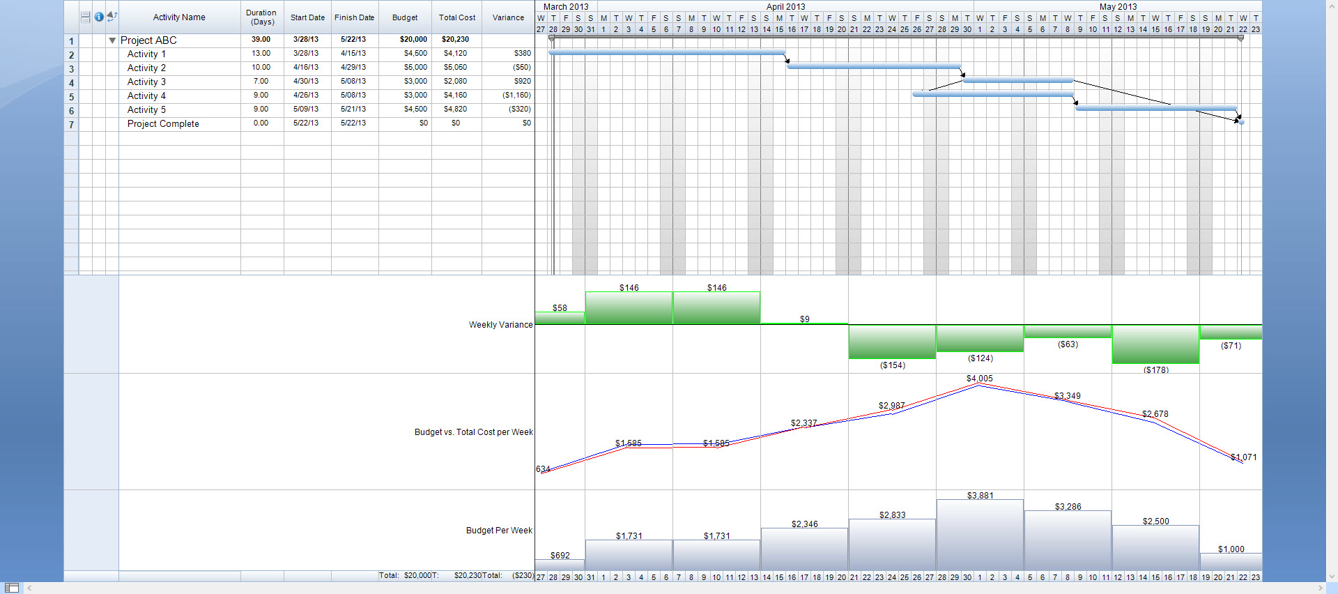
Summary Graphs will function very similar to the way a calculation column does. Anytime a change is made to a column that the Summary Graph uses, the graph will automatically update to reflect the current data. As costs in the project change, we can always keep an eye on exactly what our weekly cash flow is and where there may be areas with large variances indicating over budget tasks in our project.
Those are just 3 examples of ways we can use Summary Graphs to add detailed cost information to our project. In FastTrack Schedule 10 you can create Summary Graphs for virtually any project data, as long as it is stored in a column. What type of graphs can you add to your project to help better visualize the distribution across time?
