
In our projects there can be a wide variety of data that we need to keep track of such as dates, durations, resources assigned, costs, and other data. However we may not always be able to display the data we wish to track directly within a column. In some cases we may want to easily display a cash flow chart for our project. In FastTrack Schedule 10 there are many pre-defined Summary Graphs, within both new, blank files and our Free Project Management Templates, which can be used to easily convey cash flow style information.
By default every schedule will have several Summary Graphs that users can easily view. The most commonly used Summary Graphs are found within the Cost Layout and provide information on Resource Costs, Fixed Costs, and Total Costs on a monthly basis. These graphs use the data from each corresponding column (Resource Cost, Fixed Cost, Total Cost) to calculate where the costs occur throughout the project. This can be further refined by adjusting the time increments in the graphs.
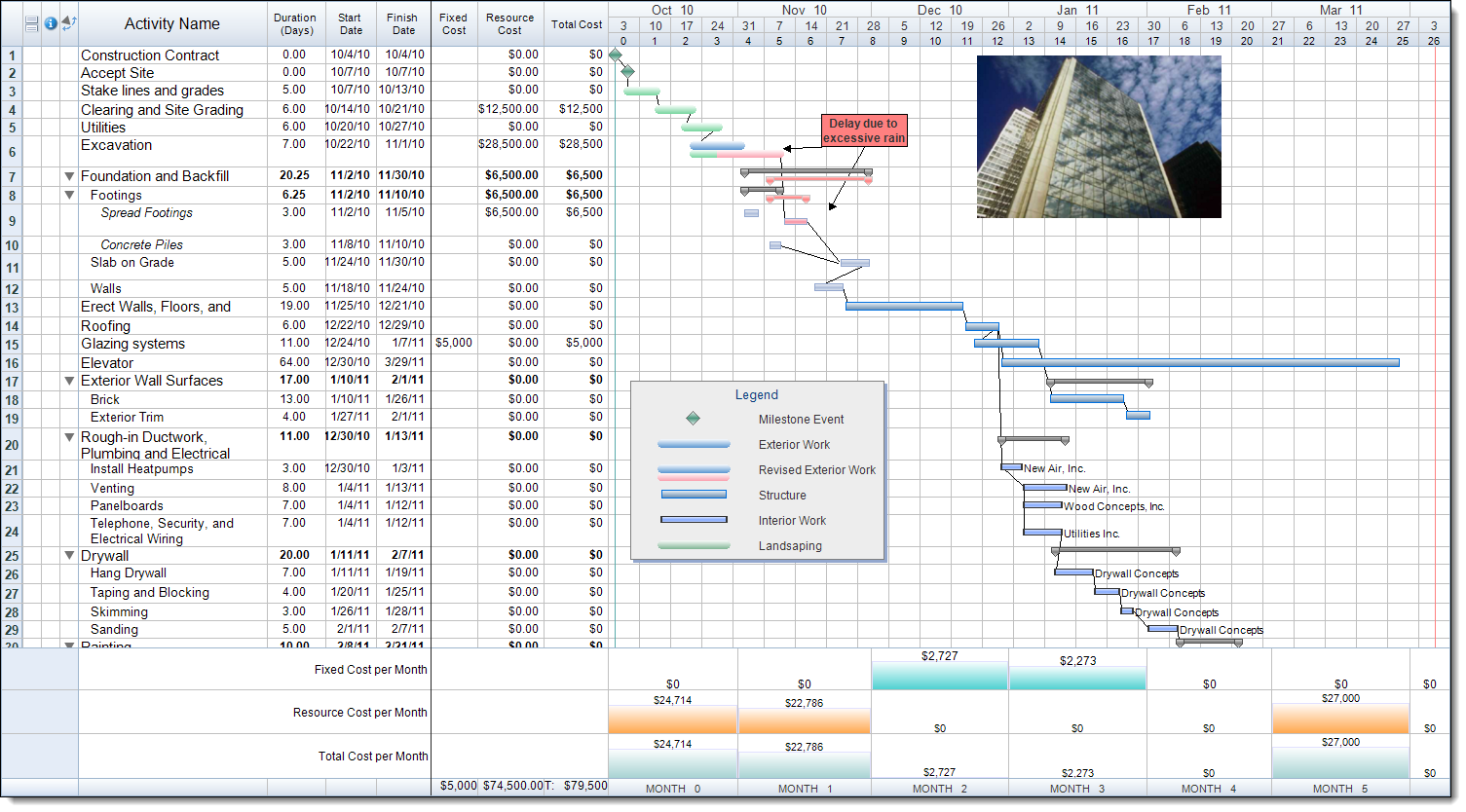
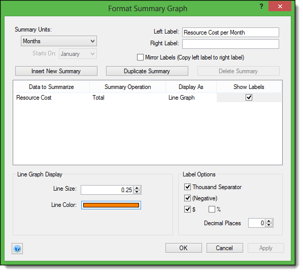
As we can see the default settings of the pre-defined graphs will use similar styles, with a histogram display and label for the exact value. Users are able to change how these pre-defined graphs appear at any point in time. To do so, double click in the shaded area to the left of the graph name. This will open the Format Summary Graph dialogue. Here there are options to change items such as the Label, Unit, Graph Display, and Label formatting. Below I have made the simple change of displaying the graph as a Line Graph.
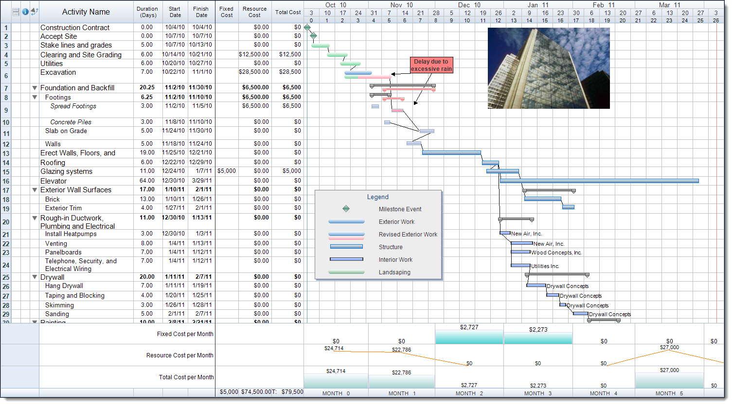
Once we apply this we can more easily see how the cost varies from one month to the next. We can see how gradual the change from the cost within one time period is to the next time period in the schedule.
In addition to these pre-defined Summary Graphs, many of our free template files contain unique graphs as well. For example within this file (Commercial Construction) there are several additional Summary Graphs. These graphs can be found within the Estimate Layout. As we can see we now have 3 additional graphs showing: the Original Estimate, Revised Estimate, and Variance per month.
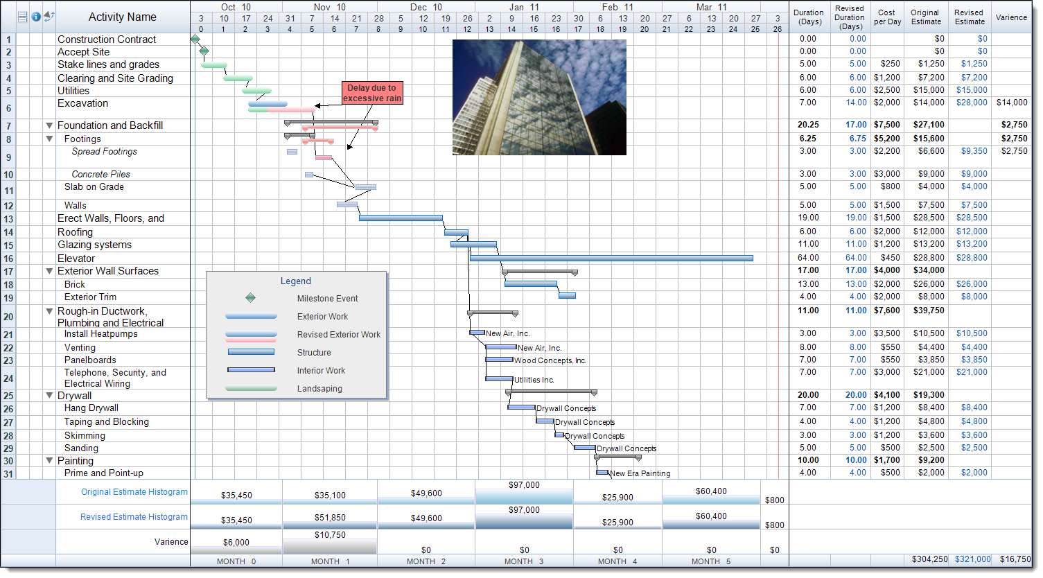
Much like the Summary Graphs within the Cost Layout, the graphs within the Estimate Layout can also be modified to best fit our display preferences. While FastTrack does offer a wide variety of pre-defined Summary Graphs there may not always be one that fits your specific needs. In those cases FastTrack will also allow users to create their own custom Summary Graphs, as outlined here. These graphs can be set up to display data from virtually any column within a schedule. Is there a pre-defined Summary Graph that you typically find yourself using? Or have you found the need to build one that is more specific to the data within your own projects?
