
Resource management is often one of the most integral aspects of planning and tracking projects. An efficient project manager needs to be able to easily identify when resources are assigned, when they are free, and if there are any “trouble” areas, such as over-allocations, throughout the project. In FastTrack Schedule 10 we can easily identify all of these items by utilizing the Resource View. While in the Resource View there are 3 unique Resource View Summary Graphs that we can utilize to view this key information.
The 3 Resource View Summary Graphs are Percent Work Usage, Hourly Work Usage, and Assignments. Each of these graphs will display unique information about individual tasks and all of a resource’s combined work throughout a project.
The first Summary Graph that we will look at is the Percent Work Usage graph. This graph is designed to show the total percentage or amount of effort that a resource is applying across all of its assigned tasks during a specific time period. For example if our Timeline Graph is displaying units in days, then we will see the percentage of effort per day applied by each resource. There is red line drawn to indicate the maximum effort a resource can apply which is 100%. The graph will then be drawn and colored according to the resource’s actual work. In this case a blue graph means they are working at or below their maximum effort per day, and a red graph indicates they have exceeded their maximum effort per day.

The next Summary Graph that we can view is the Hourly Work Usage graph. This graph is very similar to our Percent Work Usage, the main difference being that instead of showing a percentage of work, it will show the total hours worked across all tasks within a single time frame. Once again there is a red line drawn to indicate the maximum hours per day, which is set to 8 hours in this file. Light green bars now represent that a resource is working at or below their maximum allocation and dark green represents they have exceeded the maximum hours per day. In the case of both graphs you can easily update the colors that are displayed based on your own preferences.
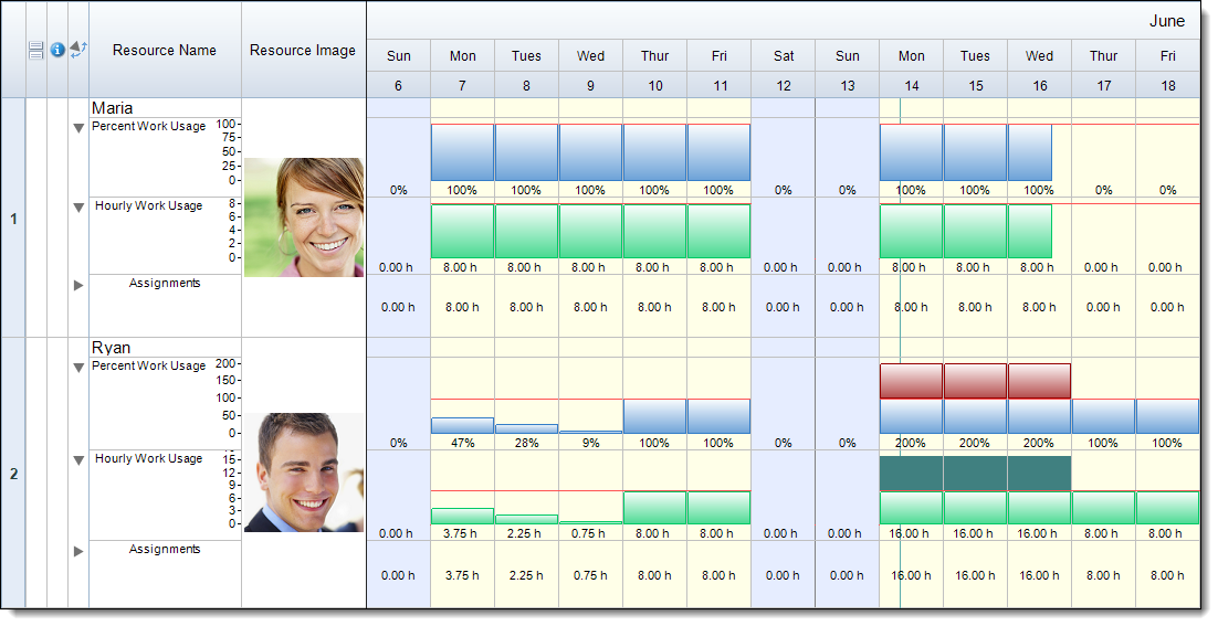
The final Resource View Summary Graph is Assignments. The Assignments graph simply pulls over all activity bars that a resource is assigned to and displays them in the order the resource was assigned to them. The activity bars will appear using the same color/style that was applied to the bars in the Schedule View.

When we view all 3 Summary Graphs at once it allows us to make better sense of exactly what is happening with our resources. We are able to easily identify how much effort is being put forth and how many hours per day that the resources are working. When we see over-allocations in our schedule we can easily use the Assignments graph to see when we have overlapping tasks and gain a better understanding of what types of changes we can and need to make to our schedule.
Resource View Summary Graphs allow us to easily view and manage resource assignments throughout our projects. They help us to better visualize the exact work that each resource is scheduled to accomplish. How can you utilize Resource View Summary Graphs to pin-point trouble areas in your schedule and make adjustments so the project will run as smoothly as possible?
